Digital accessibility to-do lists for Kamala, Donald, Chase, and Jill
Introduction
There are four notable declared candidates
(according to Ballotpedia) for president of the United States: Kamala Harris, Donald Trump, Chase Oliver, and Jill Stein. They all operate websites to present their platforms, recruit volunteers, solicit donations, and attack one another.
Those websites can be made more effective. Among other things, they can be made more accessible.
What’s special about an accessible website?
An accessible website incorporates internationally adopted standards for design and coding. It thereby reaches a larger and more diverse audience. It lets visitors navigate with less confusion, find what they want faster, understand the content more completely, and finish the transactions that they begin.
The standards are reasonably clear, and it is possible to check instantly whether a website follows many of them. Not only that, but violating those standards has gotten thousands of organizations into legal trouble for alleged disability discrimination. It’s a no-brainer: Make the site accessible!
I was curious: How are the presidential candidates doing with website accessibility? After all, if they can’t get their folks to follow the rules when making a website, can they be trusted to run the entire executive branch, act as commander in chief, and nominate justices and judges?
Here’s what I found
All four websites have work to do. They all violate simple, basic acessibility rules—rules that would have been easy to obey, with impacts on usability for various audience subtypes.
To-do 1: Help users fill out forms
Candidate websites contain forms. If you want to get news bulletins, you fill out a form. If you are ready to donate money, you fill out a form. To volunteer time, fill out a form.
Well, there are rules for accessible forms. In particular, the website must make it clear what information is to be provided and must also let the visitor enter standard types of personal data automatically.
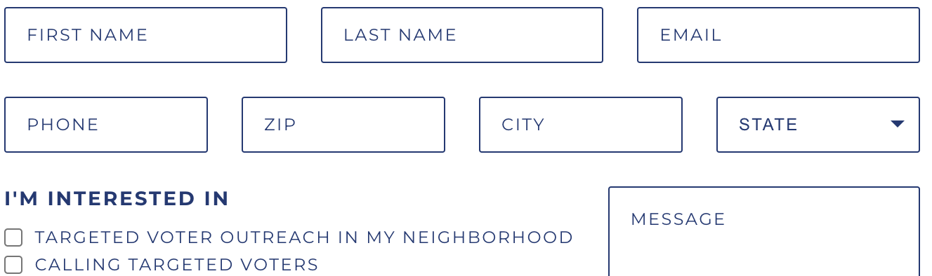
Harris
Here we see a Harris form asking for the visitor’s email address.

It obeys two rules:
- Label the inputs visibly.
- Keep the labels present while the visitor enters text.
But it breaks two other rules:
- Use ordinary letter case, not all-capitals (for easier legibility)
- Code the inputs with the correct
autocompleteattribute (so visitors who have trouble typing can use automated form-completion tools).
Here is the invisible code underlying the email input:
<input class="signupform__form-input signupform__form-input--email form__form-input form__form-input--email input-group__input" type="email" id="email-sticky" name="email" title="Please enter your email" required="" placeholder="email@email.com" field_signature="1029417091" form_signature="8925083436725633828" alternative_form_signature="14528359747955108172" visibility_annotation="true">
That code needs to include autocomplete="email", but it is missing.
Trump
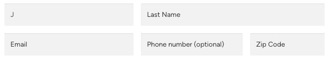
This form on the Trump site breaks the letter-case rule by using capital letters throughout the form.
It also breaks the durable-label rule by using only placeholders inside the text input fields. A placeholder disappears as soon as you start entering your answer in a field. Here is an example, where I have entered J
and can no longer see what the field is for. A person with memory limitations or anybody who gets distracted is affected by this violation.

Furthermore, it breaks the requirement to provide autocomplete attributes.
Oliver
This form on the Oliver site breaks the durable-label rule and the autocomplete rule.
Stein
A similar form on the Stein site breaks the same two rules.
To-do 2: Don’t make me click
Not everybody who browses on a full-size computer uses both a keyboard and a mouse. Many people with impaired mobility or tremors cannot control a mouse precisely enough. Users who cannot see typically avoid mice, since they don’t know where they would be clicking or dragging. And some super-users are more productive using only a keyboard.
A fundamental accessibility rule is that no website may require the use of a pointing device such as a mouse. But the websites of the presidential candidates break that rule.
Harris
When you first visit the Harris home page, before it has had a chance to deposit cookies on your computer, the site displays a modal dialog
, namely a popup window, asking for money, and then, a few seconds later, another modal dialog inviting you to subscribe to notifications. Here is the page after these dialogs have appeared.

If a modal dialog is accessible, it can be dismissed in two ways without a mouse: (1) You can press the Escape key. (2) There is a Close
button, which you can reach by pressing the Tab key once or a few times. It then gets surrounded by an outline, so you know it is focused
. You can then press the Space or the Enter key to operate that button.
What about these modal dialogs? If you have no mouse and you want to get rid of them, you need to choose a donation amount. The Harris site never lets you focus the Later
or CLOSE
button by pressing the Tab key. Pressing the Escape key does nothing. You also cannot focus the notification options with the Tab key. But you can focus the donation amounts. If you focus one of them and then press the Enter key, you will navigate to an ActBlue page, where you can complete a donation if you wish. But you are no longer on the Harris site.
Trump
The Trump site, too, starts you off with a modal dialog asking for money. Here it is.

It, like the Harris dialog, cannot be dismissed without a mouse. The X
in the corner will close the dialog if clicked, but you cannot reach it with the Tab key. You cannot even reach the donation amounts, and the Escape key has no effect.
Oliver
The Oliver website is a guessing game for a visitor who does not use a mouse. Accessibility standards require the page to show clearly where the Tab key has placed the focus. That is critical information, because whatever link, button, or input has the focus is the one you will operate if you press the Enter key, the Space key (for a button or checkbox), or text keys (for an input). An easily visible outline is the normal indicator of focus. But most often when you press the Tab key on the Oliver home page you see no focus indicator, so you are lost without a mouse. In some cases there is a focus indicator, but it is not a typical outline and is likely to be misunderstood. Here is an example, where it is a thin dashed line that hugs the text.
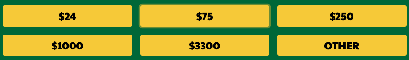
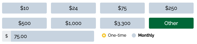
Stein
Focus indication is generally good on the Stein website, but not always. Here is a donation form on which one amount has been focused, but it takes good vision and scrutiny to notice the faint focus indicator around the $75 amount. If you press the Enter key you are taken to another donation page with the $75.00 amount filled in for you. But what if you intended to donate another amount? You cannot focus any of the other amounts with the Tab key. You can focus the input field and type a different amount, but the focus indicator is faint, so you may not understand where you are.
To-do 3: Ask for help from your visitors
There is a consensus among accessibility specialists that candid two-way communication with the consumers of a website is crucial for genuine accessibility. It has become a standard practice to publish an accessibility statement
. The statement tells visitors what kinds and amounts of accessibility the site owner is trying to achieve and how close to success the owner believes the site has come. The statement also invites comments and complaints from visitors and provides a channel (or preferably more than one channel) of communication for submission, typically email, a comment form, and/or telephone.
The Harris website is the only one of the four making an effort to implement this practice. The home page has a footer containing an Accessibility
link. That link takes you to a page named WEBSITE ACCESSIBILITY STATEMENT
. There the Harris campaign tells you, We're continually working to improve the accessibility and usability of our site, so that all users have an excellent experience.
The page identifies a standard the campaign is trying to conform to: Web Content Accessibility Guidelines 2.1 level AA. And the page invites you to provide complaints or suggestions and gives an email address.
The other three campaigns say nothing about accessibility on their websites.
To-do 4 through 79
These three examples should make it clear that (1) all four candidate websites have accessibility faults to remedy and (2) making such improvements is not rocket science.
On each of the four home pages, I also performed about a thousand automated accessibility tests, from eleven different tools. The tools come from universities (including Princeton, Lisbon, and Utah State), an industry organization (the World Wide Web Consortium), and companies (IBM, Deque, Siteimprove, Squiz Labs, Wally, CVS Health, and eSSENTIAL Accessibility). To run these tests I used open-source software described in my recent blog entry How to run a thousand accessibility tests
. Such mass-production testing can find problems that human testers miss, and it is inexpensive. But it can also report mistaken or questionable faults that a competent human tester would not.
The software aggregates the test results into a single numeric deficit score for each page. Here are the scores:
| Candidate | Deficit score |
|---|---|
| Stein | 3062 |
| Trump | 3759 |
| Oliver | 5258 |
| Harris | 7009 |
Thus, the Stein home page received the best score, and the Harris home page received the worst score.
More significant, in my opinion, is the fact that each of the four pages was found to have dozens of accessibility issues (problem types) appearing, in total, hundreds of times. Specifically, the tests report:
- 70 issues on the Harris page
- 59 issues on the Trump page
- 79 issues on the Oliver page
- 70 issues on the Stein page
There, dear campaigns, are your accessibility to-do lists, ranging from 59 to 79 items long. You can review the reported issues, decide which ones are credible, and make those fixes.