Mirror, mirror on the wall, who’d be the fairest mayor of all?

New York mayoral candidates ranked best to worst on digital bias
Although all candidates for mayor of New York profess a commitment to equality, diversity, and inclusion, their own campaign websites tell a different story, according to a new independent ranking. Some prominent anti-discrimination advocates practice digital bias by publishing web pages full of accessibility defects, violating industry and legal standards that aim to make digital content more usable for everybody and especially for people with sensory, physical, cognitive, and age-related limitations.
The ratings
How do the candidate web pages stack up?
In the following ratings, based on a method employed by Johns Hopkins University, the candidates’ home pages are ordered from most (at the top) to least (at the bottom) accessible. Details on the methodology are below.
Accessibility makes strange bedfellows
By this rating:
- The three top candidates are non-
major
ones. Other candidates have far more money for website development, but also-runnings still beat the competition. - The two candidates almost tied for first place are ideological opposites: less-government libertarian Prussman and more-government working-class democrat Taylor.
- Of the
major
candidates, the best (Morales) and worst (Wiley) performers both advocate decreases in police funding. - Qualifications do not guarantee performance. Of the four worst-ranking websites, three belong to a civil-rights attorney (Wiley), a Ph.D. student in information science (Francis), and a 14-year director of a city agency that is required by law to operate an accessible website (Garcia).
What’s wrong?
One of the testing tools used for this rating, Axe, classifies web-page accessibility defects from critical
(the worst) to minor
.
Axe found 105 critical defects in the candidates’ home pages. Of these, 60 were violations of its image-alt rule. This rule, widely known in the web-development industry, requires that every image (photo, drawing, logo, icon, etc.) be equipped with an alt attribute. That is code, invisible to the page viewer, identifying the image as purely decorative or informative, and, in the latter case, expressing as text the information in the image. If you are a blind or visually limited user who navigates by listening to a screen reader
, you depend on those alt attributes. Otherwise, you get nothing out of images.
Five of the home pages exhibited these image-alt violations: those of Eric Adams, Raymond McGuire, Maya Wiley, Christopher Krietchman, and Paperboy Prince. But Maya Wiley’s page accounted for 56 of the 60 violations. The Wiley page contains, for example, 22 logos of organizations that have endorsed the candidate. They do not have alt attributes, so a screen reader would tell you image
22 times, but would say nothing more about them.
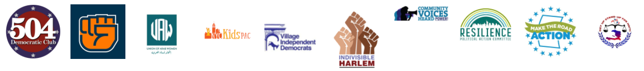
Even if you can see, you might not understand some Wiley endorser logos. One contains only an orange fist; what is that? For better accessibility, the logos would have not only alt attributes, but also visible text labels, telling all, blind and sighted alike, what each logo represents.

To avoid hurting users with some attention and cognitive limitations, an accessible web page does not force users to keep witnessing moving objects. Eric Adams’s page contains a gigantic Eric Adams NYC Mayor
banner perpetually scrolling across the window, and you cannot stop it.
These last two flaws are examples of the many defects that the tools used in this rating, Axe and WAVE, cannot identify.
And these tools often get fooled. For example, Kathryn Garcia’s home page shows an image of the phrase ENDORSED BY THE The New York Times
. The image has an alt attribute. But the value of the attribute is blank; this says (falsely) that the image is purely decorative. Axe doesn’t know better, so it gives this image a free pass. Axe does, however, complain that the image is used as a link, so a blind user would not know what the link leads to.
Moral of the story
Current tools for measuring digital qualities such as accessibility, while imperfect, can still serve to make websites magic fairness mirrors. Websites reveal digital inclusion, and therefore competence in procuring bias-avoiding technical expertise. The savviest candidates know (or are advised) that
- there are gaping digital divides in New York;
- a website can bridge them with user-friendly, inclusive, and accessible design and engineering;
- New York laws and regulations require websites to comply with accessibility standards;
- each year thousands of public and private website owners get sued in New York for violating those standards;
- and, nonetheless, New York City government is replete with user-confusing web pages.
Twenty-two current candidates for New York mayor are demonstrating, with their campaign websites, whether they can run organizations that avoid the discrimination that they purportedly oppose. Doing that on the web is so cheap that some poorly funded candidates have achieved a lot of it. What, then, explains the inaccessibility of the web pages of several well-heeled candidates? Not prohibitive cost. Perhaps a deficit of savoir-faire, including limited skill in choosing experts to do an important job.
Credits
This work was inspired by the Johns Hopkins University Vaccine Website Accessibility Dashboard and by colleagues who examined 2020 presidential candidate websites. This work is entirely my own and does not represent my employer, CVS Health.
I thank Jared Smith of WebAIM for details on the Vaccine Accessibility Dashboard method.
Appendix: methodology
For you IT wonks, here is a description of the method that produced the above table.
First, perform a WAVE comparison of the pages. To do that, run WAVE on each page, then:
- Give each page a rank, on the basis of its error total, namely the total of its
Errors
and itsContrast Errors
, with 0 being the best rank (i.e. the smallest total). If there is a tie for the next rank, use that rank for all of the tied pages, but then skip ranks so that the used rank plus the skipped ranks are equal in number to the number of tied pages. - Give each page a rank, on the basis of its error density, namely its error total divided by the total number of its elements. Use the above rule for ties.
- Give each page a rank, on the basis of its alert total. Use the above rule for ties.
- For each page, multiply its error-total rank by 6, multiply its error-density rank by 3, and multiply its alert rank by 1.
- Total those three products. That total is the page’s deficit score.
Second, perform an Axe comparison of the pages. To do that, run Axe on each page, then:
- Give each page a rank, on the basis of its total of minor violations. Use the same rule for ties as in the WAVE comparison.
- Do the same for each of moderate, serious, and critical violations.
- Rank the pages four more times, on their violation densities (minor violations divided by total number of elements, etc.)
- For each page, multiply its violation ranks by 1 for minor, 2 for moderate, 3 for serious, and 4 for critical.
- For each page, multiply its violation densities by 0.5, 1, 1.5, and 2, respectively.
- Total those eight products.
- To make the Axe deficit score comparable to the WAVE deficit score, multiply this total by 8/11.
Third, for each page, add the Axe deficit score to the WAVE deficit score.